
If you’re leading packaging for a food or beverage brand, you already know the uncomfortable truth: great flexible packaging design is equal parts creativity and constraint.
Yes, your pouch has to look amazing. But it also has to:
- read clearly from a few feet away (and on a tiny e-commerce thumbnail)
- survive real-world print, lamination, and sealing
- leave room for required labeling and claims without looking cramped
This guide is built for decision-stage teams. You’ll get a practical set of flexible packaging design ideas you can use immediately—plus a clean way to evaluate whether a packaging partner can execute what your creative team is imagining.
What “stands out” really means in flexible packaging design
A pouch wins when it communicates three things faster than the competitors around it:
- Who it’s from (brand)
- What it is (product type / flavor / variant)
- Why it’s worth picking up (benefit, proof, or reason to believe)
That’s visual hierarchy. As StrongWeb explains in its breakdown of visual hierarchy in packaging, the goal is to guide the eye intentionally—not just decorate the surface.
Key Takeaway: If your pack looks “busy,” it’s usually not a design problem. It’s a hierarchy problem.
Best practices: creative flexible packaging design that still prints clean
1) Design “brand blocking” first—before you add the fun stuff
Brand blocking is the non-negotiable zone where your logo + product name + primary benefit live together with high contrast.
Why it matters:
- it improves recognition across SKUs
- it keeps your pack readable in retail lighting and on mobile
How to implement:
- reserve a consistent block (often top third or center)
- keep the background behind key text calm (solid color, subtle texture, or minimal pattern)
- test it as a 1-inch-tall thumbnail before you approve anything else
Failure mode:
- your design looks beautiful close-up, but the brand disappears at shelf distance
2) Make typography carry meaning—not just style
Food and beverage packs typically contain more information than designers want to admit. Typography is where most flexible packaging designs either become premium—or become unreadable.
A practical rule of thumb: limit the number of typefaces and make the hierarchy obvious. If you want a simple baseline for packaging typography and hierarchy, Paking Duck’s guide to typography basics for packaging design reinforces the core idea: legibility first, then personality.
Why it matters:
- typography is your “silent salesperson” when shoppers are scanning fast
How to implement:
- use one primary display font + one supporting font
- make the product name the clearest line on the pack
- ensure contrast is strong enough that text doesn’t wash out on film
Failure mode:
- you add a third and fourth font to “create interest,” and the pack starts to feel cheap
3) Build a hierarchy that works in two environments: shelf and thumbnail
Your pouch is judged twice:
- in-store, with glare, distance, and clutter
- online, with tiny images and fast scrolling
Why it matters:
- the design that wins on shelf often needs small tweaks to win in thumbnails
How to implement:
- prioritize one bold focal point (logo, product name, or a hero visual)
- simplify secondary messages (don’t make five benefits compete)
- run a grayscale test to confirm the design still works without color
Failure mode:
- the design relies on subtle color differences that disappear in photos
4) Use color and finish to create “premium cues” without losing clarity
Color gets attention. Finish earns trust.
Why it matters:
- finishes like matte, soft-touch, or spot gloss can signal quality—but only if they’re intentional
How to implement:
- use matte/soft-touch for a calm premium base
- use spot gloss selectively to pull the eye to the logo or key benefit
- keep your color system consistent across SKUs so line extensions feel related
Failure mode:
- too many effects (foil + gloss + heavy gradients) create noise and reduce readability
5) Plan compliance and required labeling as a design system—not a last-minute patch
If your product sells in the U.S., labeling rules shape your layout. Leaving compliance until the end is how strong designs get compromised—and it’s exactly how teams end up with a last-minute redesign for food packaging design compliance.
The U.S. FDA’s Guidance for Industry: Food Labeling Guide is the canonical reference for required statements and common labeling pitfalls.
Why it matters:
- required information competes with branding if you don’t reserve “legal zones” early
How to implement:
- treat the back panel as an information grid (Nutrition Facts, ingredients, allergens, manufacturer info)
- agree internally on what lives on the front vs. back
- build your concept with those blocks already placed, so you’re not squeezing them in later
Failure mode:
- you redesign the entire layout right before print because the Nutrition Facts box won’t fit cleanly
⚠️ Warning: Compliance isn’t only a legal review step. It’s a layout constraint. If you ignore it, your final design will look like a compromise.
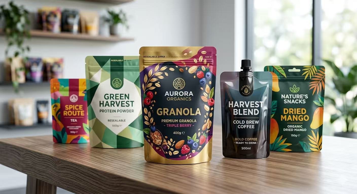
6) Let the pouch format do some of the work
The structure is part of the design:
- stand-up pouches create a billboard effect
- spouts and fitments can signal convenience and premium utility
- windows can build appetite appeal—but they can also create inconsistency across batches if not engineered carefully
If you’re still choosing formats, start with capabilities and options on Jili Packaging custom pouches and align format to the job-to-be-done: pourability, reseal, portioning, or shelf stability. For example, a stand up pouch design can create a stronger front-panel “billboard” when your brand needs instant readability.
7) Prototype early so your best idea survives production reality
Creative teams often approve design on screen. Production reality is different: film reflectivity, inks, sealing areas, and tolerance all change what “good” looks like.
Why it matters:
- early prototypes prevent expensive rework and timeline slips
How to implement:
- run a rapid physical sample or high-fidelity proof
- check readability under realistic retail lighting
- confirm the design still holds when the pouch is filled and standing
Failure mode:
- you discover after the first run that gradients band, fine lines break, or the seal area interrupts the layout
If speed matters, Jili’s rapid prototyping approach is built for this exact moment: validate the concept before committing to volume.
A simple checklist to evaluate a flexible packaging design partner
This is where decision-stage teams win: you don’t just pick a printer—you pick a process.
Look for partners who can answer these questions clearly:
- How do you control print consistency across SKUs and reruns? (Ask about color management and QC checkpoints.)
- How do you handle high-impact graphics? If your design depends on rich detail, capabilities like 10-color printing matter.
- How do you reduce compliance risk? Ask what documentation they provide and how they flag layout constraints.
- How fast can we iterate? The best suppliers have a tight loop for samples, feedback, and revisions.
- What happens after approval? You want visibility into timelines, file handoff, and shipping documentation.
Pro Tip: Ask your short-listed supplier to explain the “failure modes” they look for before print. A serious team has a real answer.
How Jili Packaging helps teams turn design into shelf-ready pouches
For global food and beverage brands, the goal isn’t just a good-looking design—it’s a design you can launch confidently.
Here’s the execution model Jili Packaging is built around:
- Material engineering support to match barrier performance and shelf-life needs
- Aesthetic design support so hierarchy, typography, and brand systems translate to flexible film
- Sampling and rapid prototyping so you can validate the pack before committing
That’s the core of the 3F framework (Free Material Engineering, Free Aesthetic Design, Free Sample Kits), paired with production control and documentation. If your team needs a deeper view of risk reduction, see Jili’s approach to quality and compliance.
Sustainability is also increasingly part of brand decision-making. If you’re exploring recyclable or lower-impact options, start with Jili’s overview of sustainable packaging and align material choices with the recycling realities of your target markets.
FAQ: flexible packaging design for food and beverage brands
What’s the biggest mistake in flexible packaging design?
Trying to say too much at once. A pouch that has five competing messages usually sells less than a pouch with one clear promise and a clean hierarchy.
Should we design for shelf or e-commerce first?
Both—because shoppers now move between channels. Build a hierarchy that reads at distance, then validate it as a small thumbnail before you finalize.
Do minimalist designs always perform better?
Not always. Minimalism tends to increase clarity and premium cues, and Meyers notes that minimalist, eco-friendly packaging can increase consumer trust, but your category norms, price point, and flavor architecture still matter.
How do we connect sustainability to packaging design without greenwashing?
Treat sustainability as a system choice, not a graphic choice. McKinsey’s perspective on sustainable packaging levers is helpful for grounding decisions in real impact.
When should we request prototypes?
As soon as your concept is 70–80% defined—before you lock in final artwork and definitely before you commit to a large run.
Next steps
If you’re evaluating a new pouch design (or refreshing an existing one), a fast way to reduce risk is to validate three things early: hierarchy, compliance layout, and print feasibility.
CTA: Share your dieline and design concept with Jili Packaging to get material guidance, a production-ready review, and a rapid sample plan.